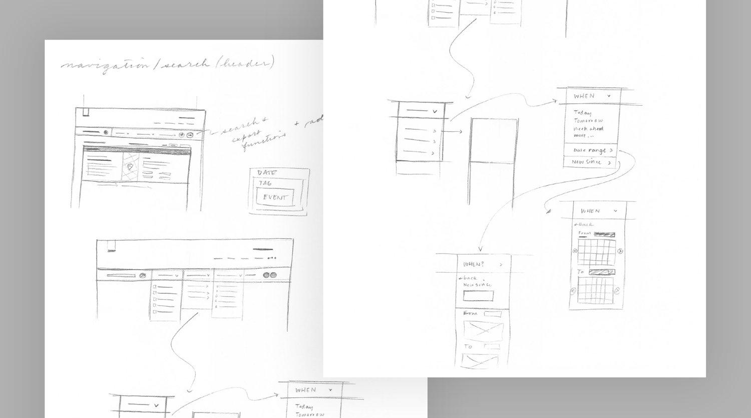
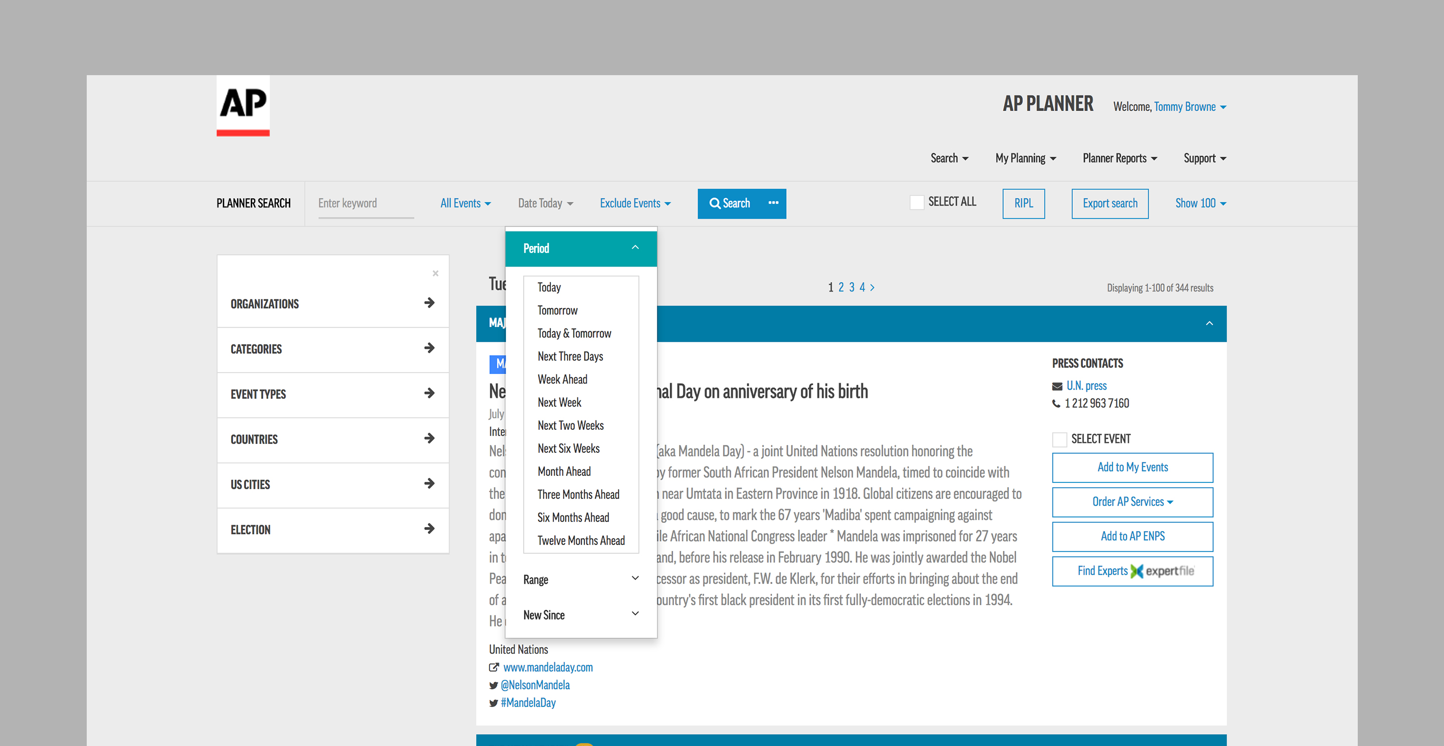
I was asked to provide recommendations for the visual and UX design of the new version of AP Planner, a planning tool for media and PR companies. I employed the design system I created for AP's content-delivery platform, AP Newsroom, to help streamline the planning tool with smarter navigation, refocused hierarchy and improved functionality.

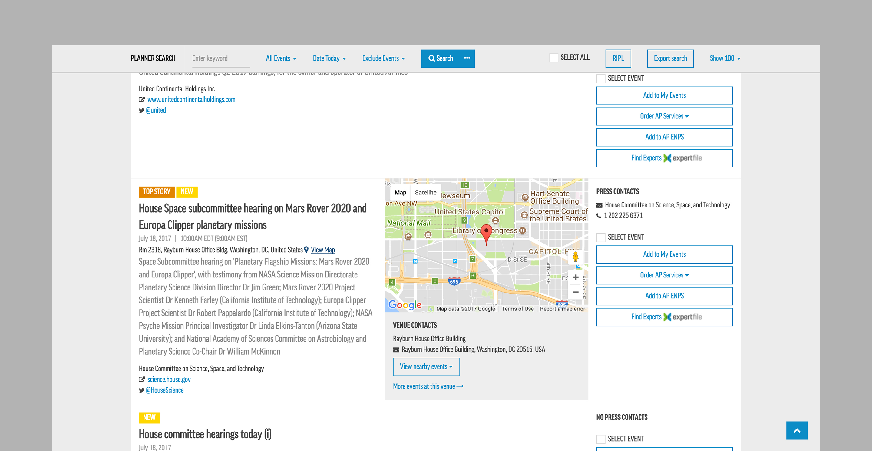
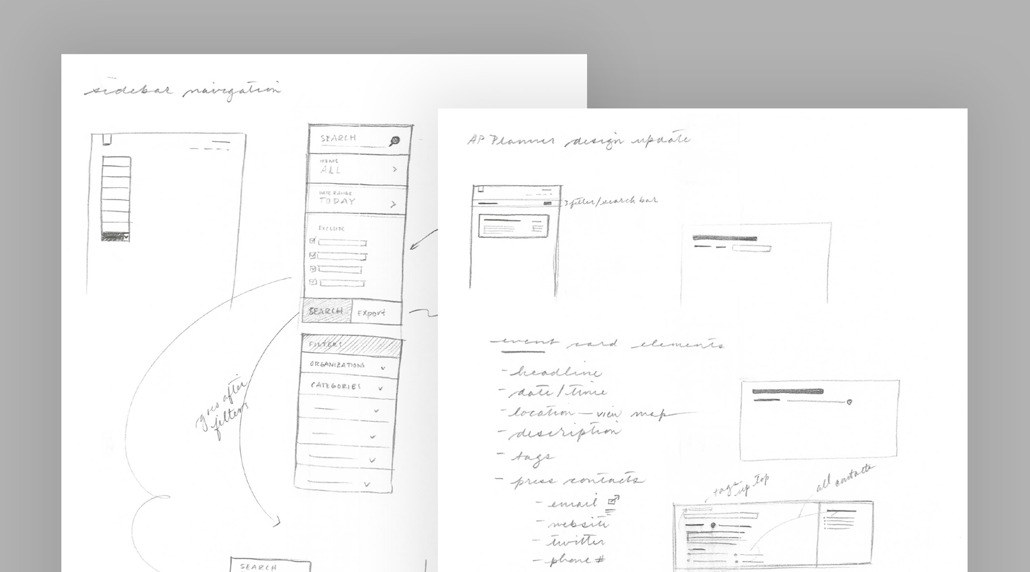
The design system focuses on the content itself, which sits on white cards. Functional elements like filters and toggles are collapsed into a toolbar, reinforcing the focus on the planned events.


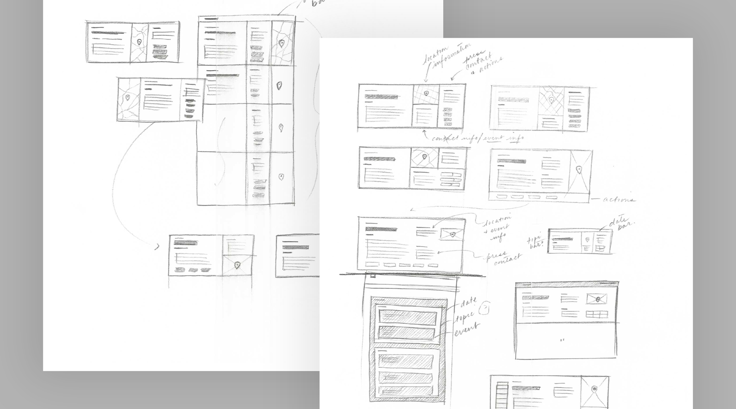
Dividing the event cards into three sections — event details, location map and actionable content — streamlined the hierarchy and improved usability.